


Client |
ROGERS LOWELL CHAMBER
ROGERS LOWELL CHAMBER
BACKGROUND
In 2021, with its Centennial Celebration around the corner, the Rogers-Lowell Area Chamber of Commerce decided a rebrand was in order. More detail on the process behind the rebrand is detailed in the Brand Identity section of this portfolio.
With this logo, I directed a team of 2 other creatives through 4 waves of revisions, 64 logo variations, 2 rounds of A/B testing and community input from our stakeholders to arrive with this logo.
DESIGN DETAILS
This logo represents a new, modern approach for an organization that has existed since 1922. It’s bright colors and use of gradients gives it a modern flare that engages viewers, especially those younger viewers who knew little about the Chamber prior to it’s rebranding. The tagline gives it a solid, centered foundation, bring the mission and vision of the organization into a prominent brand promise that’s meant to also show transparency in what we aim to do.
The blue, green, and red are an ode to the RGB color schemes of old (think tube televisions), but their brightness, layered construction, and hard, rounded lines evoke a dynamic stability in its construction.
Finally, as the premier chamber organization in Northwest Arkansas, the state outline itself is brought into the “C” letter form showcasing the Chamber’s commitment to the growing, exciting region they call home.
Event |
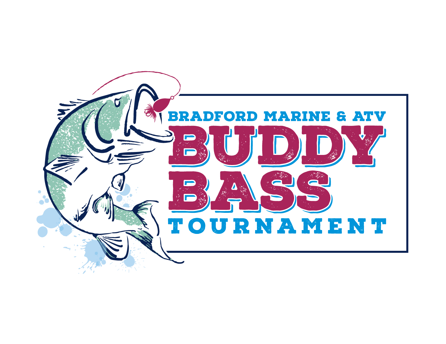
Bradford marine & atv
buddy bass fishing tournament
Bradford marine & atv
buddy bass fishing tournament
This event, held annually at Prairie Creek Marina near Beaver Lake in Arkansas, got a logo revamp to celebrate it’s 30th year.
Client |
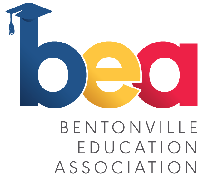
BENTONVILLE EDUCATION ASSOCIATION
BENTONVILLE EDUCATION ASSOCIATION
BEA is a new organization established to be an advocate for teacher’s and administrators in Bentonville, AR, who were looking for a fresh, modern logo to encourage folks to engage with them professionally.
Client |
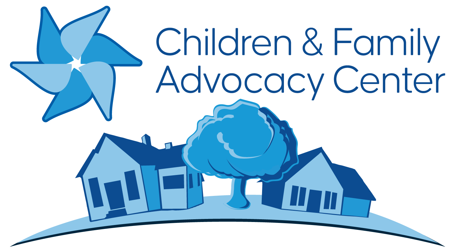
Children & Family Advocacy Center
Children & Family Advocacy Center
The Children & Family Advocacy Center consolidated 2 previous organizations in Northwest Arkansas, and wanted to harken back to both with the all-blue color scheme and inclusion of the child’s pinwheel symbol.
Event |
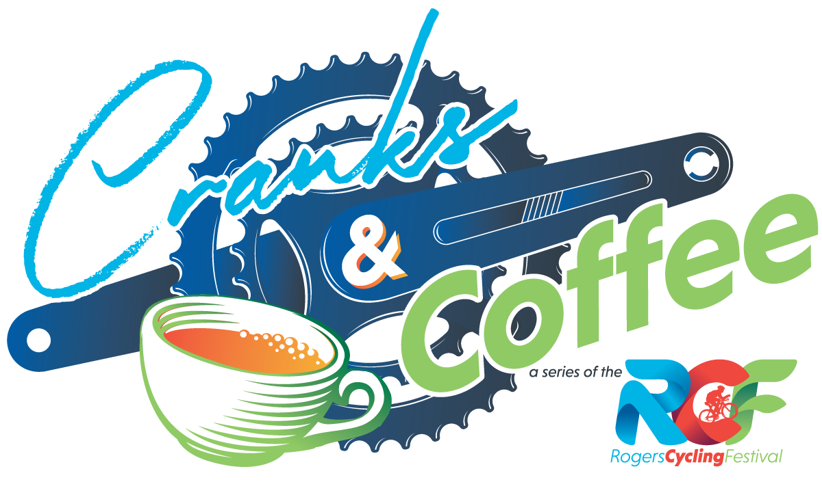
Cranks & Coffee
Cranks & Coffee
Cranks & Coffee is meant to be a partner event to the Rogers Cycling Festival (RCF), encouraging cyclists and non-cyclists alike to network, enjoy some coffee, and support local businesses around the RCF.

Client |
Destination rogers
Destination rogers
When the Rogers Lowell Chamber rebranded, all sub-brands also got a facelift. Visit Rogers became Destination Rogers, and their logo became directly influenced by the new, modern aesthetic of the RLC.

Client |
Engaging empathy
Engaging empathy
Engaging Empathy integrates the artwork and library resources of Crystal Bridges Museum of American Art in lessons to strengthen empathy and literacy in secondary schools.

Client |
Leaf to Soil
Leaf to Soil
A small, local business based in Elm Springs, Arkansas with over 25 years of experience in landscape, turf, irrigation, and chemical applications. They wanted a personal touch to their logo, which is why one of their owners’ fingerprints is in the leaf’s facade.
Client |
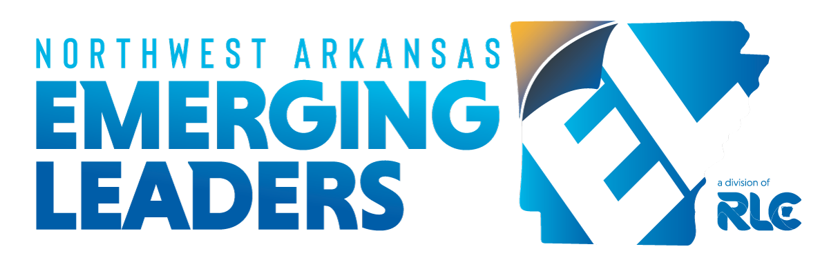
Northwest Arkansas Emerging Leaders
Northwest Arkansas Emerging Leaders
NWAEL empowers young professionals to build their network, refine skills, and make a difference in their vibrant community.

Client |
pattaya thai + sushi
pattaya thai + sushi
One of my favorite restaurants in Northwest Arkansas, Pattaya wanted a logo that was both modern and had subtle hints to a local artist’s tri-color, minimalist style.
Client |
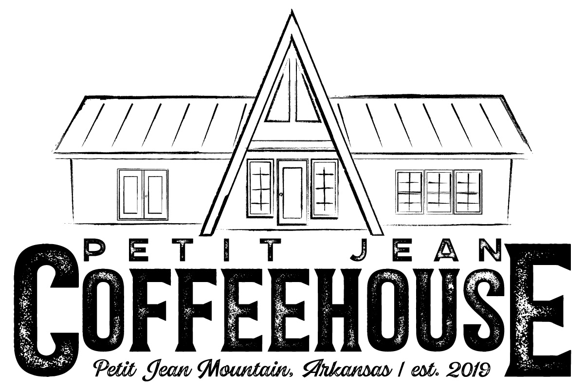
petit jean coffeehouse
petit jean coffeehouse
A rustic coffeehouse in a nationally renowned state park, the Petit Jean Coffeehouse wanted it’s locally famous a-frame design incorporated into their rustic logo aesthetic.
Client |
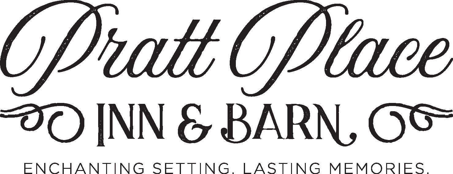
pratt place inn & barn
pratt place inn & barn
Nestled on 140 acres of Ozark meadows, this historic venue blends charming 19th-century architecture with modern comfort. Luxurious guest rooms, a spacious barn for special events, and stunning woodland views await.
Client |
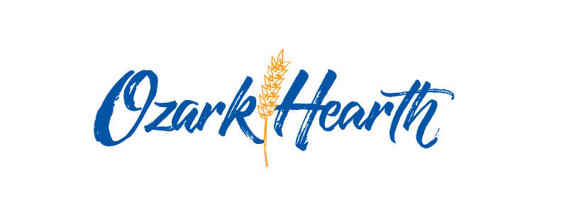
ozark hearth bread
ozark hearth bread
Rustic crusts, wholesome grains – Savor Harris Baking’s Ozark Hearth bread, from hearty multigrain to 100% whole wheat, for a taste of Ozark goodness baked with care.
Client |
single parent scholarship fund of nwa
single parent scholarship fund of nwa
Imagine single parents, chasing their dreams of higher education despite juggling child care, work, and financial hurdles. Now, imagine the ripple effect when those dreams become reality – stronger families, brighter futures, and thriving communities.

Client |
sphere wealth management
sphere wealth management
A team of investment advisors based in Northwest Arkansas looking for a logo that reflected their well-rounded philosophy and diverse backgrounds as well as portfolios.
Client |
Spoonmoon
Spoonmoon
Not just another gym, SpoonMoon is a hub of fitness, health and wellness, and holistic approaches to self-care and self-actualization.

Client |
The RLC Voice of Business Podcast
The RLC Voice of Business Podcast
A relatively new avenue for the Rogers Lowell Chamber, the Voice of Business podcast brought a whole new set of community members into the audience for the Chamber’s business and community development endeavors.